Showing posts with label Beach. Show all posts

Tuesday, 15 December 2020

"Captured Happiness" Design Team creation for 49andMarket


Hi there crafty friends. I am back with you today to share a new beachy project. Here in Australia where I live it has been mighty hot,

and the feeling of wanting to be at the beach was on my mind. But it was far too hot to venture out so a layout in the air-conditioning of my art studio was in order.

For this project I have used a different kind of photo. One of my youngest’s leg after she had sat and played in the silty mud like sand at one of

our special favourite spots a few years back. She got up and drew this smiley face which I photographed like I do with everything. And it caught my eye going

through some pics. I have titled this project “Captured happiness”. I hope you enjoy it.

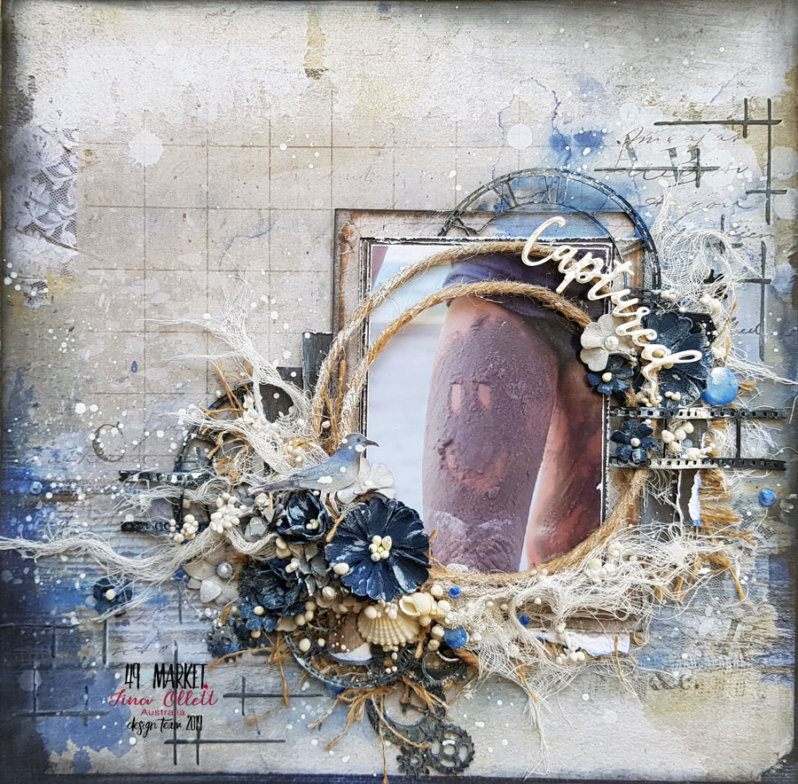
I used the “Old School” collection for my project. The colours were a perfect match so it made for a very easy project. I prepped the “b” side of  “Penmanship” with a clear gesso and added in textures using a mix of modelling paste from TCW along with a black pigment powder from Couture Creations. I also added in more colour on the background with Viva Décor Inka Gold in the colour of Cobalt Blue.

I used a second sheet from the “Old School” collection called “High School”, for the matting and layering of my portrait colour photo. Both sides of the papers were used. The edges of each piece of paper was distressed and sanded and layered amongst old pieces of board to give more dimension to my project. These were adhered more to the right side of my project.

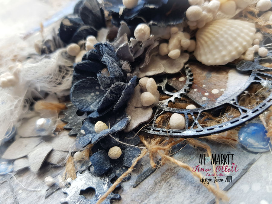
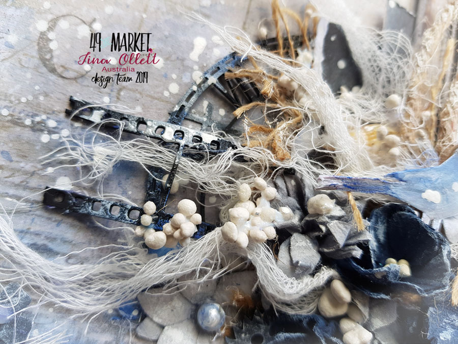
I then moved on to adding in archival boards from the black “Timeless” pack. And also a black archival board of a photo negative that I found floating amongst my stash. Colour was added to the archival boards using some of the cobalt blue in the viva gold. This looks so pretty on the black board it really does. I added over some jute cording that was wrapped twice around. Once this sat over the photo I really thought I needed a little of 49andMarket’s burlap to keep with this colouring . This was distressed a little and added amongst the layers of chipboards. Distressed sections of muslin was also used amongst the layers. These were stretched out  and then glued using a gel medium. Whilst the gel medium was still wet I sprinkled over 3 different sizes of art stones to break up the colour. I also found a cute little bird from the older collection of Heirloom Botanicals that was added in.

The addition of florals with the navy colour coming from one of my last packs of the gorgeous Botanical Potpourri’s. This would have to have been one of my most favourite colours and flowers from 49andMarket that I have put off using them for so long. I combined a pack of the mini series flowers in Storm amongst the navy flowers. Some of the flowers were split apart to go a little further.

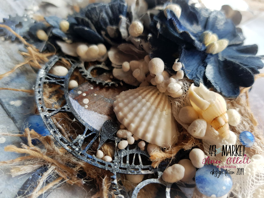
Lastly I added in my title “Captured” that was dressed in White Opal Liquid Pearls. Also some tiny shells and splatters of white gesso watered down along with a few of the Wishing Bubbles in Blueberry. I coloured over these a little more with the cobalt Inka Gold. Well that is my completed project. I do hope it has inspired you in some small way to do some crafting in the coming week. I hope wherever you live at present that you are keeping safe. Until next time take care.

Tina x

49andMarket Products Used

Old School - High School -

Old School - Penmanship

Wishing Bubbles Blueberry – Link not available

Flowers Mini Series 01 – Storm

Botanical Potpourri – Navy – Link not available

6 x 6 Archival Board Timeless Black

Jute Cord 5ply

Burlap Ribbon – Natural

Other Products Used

Archival White Captured Board

Archival Black Photo Negative Board

Liquitex Gesso – White

Liquitex Gesso – Clear

Inka Gold – Cobalt Blue

Liquid Pearls – White Opal

Finnabair’s - Art Stones (in 3 sizes)

Muslin

Friday, 31 July 2020

"Beachy" 49andMarket Design Team Creation

Hi there crafty friends. So glad to see you back here joining me today with my newest creation for 49andMarket.
This project I have titled “Beachy”.


I am so very lucky to have received the latest new release collection of Vintage Artistry Shore just in time for this blogpost. I cannot tell you how much this collection means to me. It is quite often that we see the beach collections using the blues and browns, but very rarely does it branch out into the greens of the deep oceans and reds of the corals that we have everywhere here in our beautiful barrier reef. So I was more than happy to see these colours being used for this collection. 

I did some digging to find the perfect photo as I always do and I can tell you it took me longer to choose a photo ( of which I had so many that co-ordinated perfectly) than it did to create the layout. Crazy stuff ! But I was so very happy when my oldest daughter gave me a helping hand to choose. It really made the decision making so much easier.
 
We decided on this photo of my son who will turn 21 in the upcoming week. When the children were younger the beach was where we spent a lot of time. These days not so much, but back then it was regular visits to our favourite spots. And digging was a huge part of our time spent on the beach.


So for my project today I decided to do something without flowers and to concentrate on embellishing with the fabulous laser cut elements from the collection pack. I used Triton’s Shell from the 12 x 12 Collection pack. I love this piece. The detail is amazing. I primed it with clear gesso firstly then added in a small amount of crackle paste texture through a Dusty Attic Fishnet Stencil. I also added a little of the crackle in freehand for more texture. When this was dry I made
a mix of water with Distress Ink Rusty Hinge and painted over some of the stark whiteness to dull it down a little.

 
I made layers with the Cover page of Vintage Artistry Shore using both sides of the paper. These pieces were heavily distressed and layered up with lots of dimension using old chipboard in between some of the layers. Once I adhered this to my background page I added in some distressed pieces of the 49andMarket Burlap netting. This I find to be the best to distress. I also add a little crackle over this  and then sprinkled on some art stones and also some decorative sand that I picked up at the dollar store. 
This actually looks like sand so it was a great find. Once I had the basics down
I went to work on embellishing with the Laser Cut sheets from the collection. There are two 12 x 12 sheets in each of these collections. So much to choose from. It makes it hard to decide. I added in the plants and also some of the fish which I though were just so cute. I also added in a few of the shells.

 
Lastly I added in some stamping using the stamp set from the same collection. I chose the word “Beach” which I used down the right side of the layout for my title. I also added in some random stamping of different shells around the project. I further coloured my project with more gesso and Rusty Hinge Distress Ink.


Well that is me for another blog post. I hope you enjoyed seeing the new collection and my project inspired by all of these fabulous new release products. Until next time take care and happy crafting.
 
Tina Marie – forever&always ...


49andMarket Products used:
 
 
Other Products Used
 
Tim Holtz Distress Ink Rusty Hinge
Finnabair Art Ingredients Art Stones in varying sizes https://tinamarie.com.au/product/finnabair-art-ingredients-mini-art-stones/

Decorative Sand

Saturday, 2 May 2020

"Live your life by a compass ..." Dusty Attic Design Team Creation

Hi there friends. I am back with you today to share my personal creation for The
Dusty Attic.


My project for this month came about solely from one little itty bitty piece of chipboard.  It was the Quoted Sentiments that I found in my Dusty Attic goodies box from the boss. I am sure she has done this one for me. Absolutely heart wrenching quotes, perfect for seaside projects. And it was the quote "Live life by a compass, not a clock", that really pulled on my heart strings. So this was my starting point, and everything come from that one sentiment. Inspiration sometimes comes from the smallest of things. 


So I had the sentiment, and because this is my personal post I wanted to concentrate on everything Dusty Attic. So I pulled all the pieces and some more I thought I would like to use. They are listed at the bottom for you. The quote speaks of compasses and clocks so of course they were my next chipboard pieces. But firstly I started with a bare background of corrugated Dusty Attic card. These come in 12 x 12 sheets and never before I have I used one as my sole base so this was going to be a little challenging. I primed it with clear gesso and once dried I did some freehand dressing of a spackle using a palette knife. I applied it quite heavily and left it to dry overnight. I gave it another coat of clear gesso and then went to work colouring my piece with acrylics and embossing powders.


I left the base to dry and then went to work by priming my chipboards. Some with clear and some with white gesso depending on the outcome I was looking for. Gold embossing powder was my base for the scrolls. The Baroque flourishes were dressed with two differing embossing powders to give a thick textural look. You will see in the photo below the differing blue powders. Once these  were all done I worked on the placement for each piece. I didn't use any matting for my photo, I simply sanded the edges and then swiped some acrylic paint around also. The photo was mounted up on some old chipboard outers from my stash.


I absolutely love the etchings in the Baroque flourishes. So I did my best not to cover these and left the pieces shine as much as I could. Eventually I used the flourishes to frame my photo and the sides and then the base. 


I found a half piece of the largest Skeleton Clockfaces. I then cut through the centre of it cutting out partially the numbers.  Again it was dressed similarly to the other pieces like the scrolls. I made another cluster above the clockface piece at the top right of my project. I added the two compasses that were both dressed in medias differently. I popped a couple of the smaller flourishes from the Baroque Flourish #4 set and a couple of flowers to finish off the cluster. 


I also added in some broken pendant pieces from the Elegant Pearls set that were floating in the draw. I added to the top of these some cute little hearts from the heart attack panel. Lastly I added in my Sentiment amongst the scrolls at the base of the project. I finished off by dry brushing some elements and adding in flower pearl, sequins and art stones.
Well that is all from me today. As I mentioned I have added in the products used for this project below. Just click on the links below the product photos to take you to the shop.

Until next time take care and stay safe. 

Tina x


Dusty Attic Products Used


Other Products

Liquitex Clear and White Gesso
Viva Modellier Creme - turquoise
49andMarket Sugar Petals in Raspberry
49andMarket Sugar Posies in Raspberry
49andMarket Sugar Posies in Butterscotch
Stampendous Aged Marine Embossing Enamel
Stampendous Shabby Blue Embossing Enamel
Ranger Embossing Powder Weathered White
Ranger Embossing Powder Gold
Versamark Embossing Ink
Versamarket Watermark Pen
Ranger Distress Ink Black Soot
Dress My Craft Flower Pearls - Golden
Dress My Craft White Sunshine Sequins
Finnabairs Art Stones
Ranger Distress Oxide Walnut Stain


Special Guest

Special Guest
2017