Tuesday 24 July 2018

"Once upon a time"

Hello and a big welcome today. I am back with you to share a little project that I have created for my Maja Design Team post . Sometimes I run late with projects and they are the days I find I am the most productive. In saying this they are also usually my most favourite projects.
And this one is no exception.


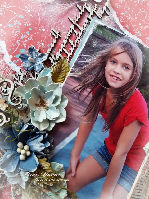
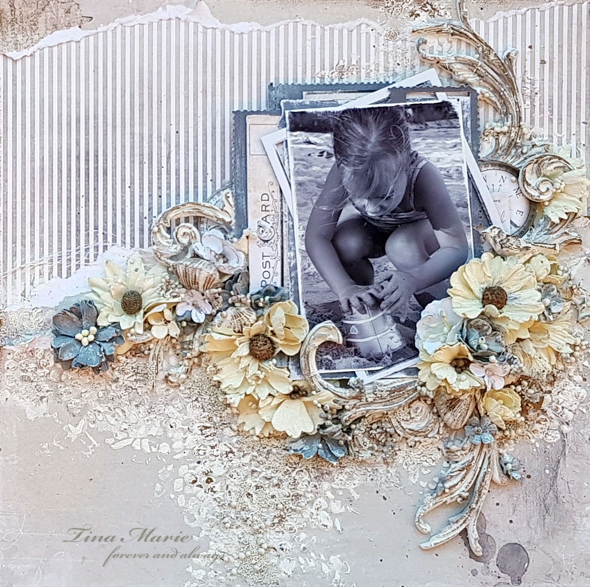
 This is "Once upon a time.........
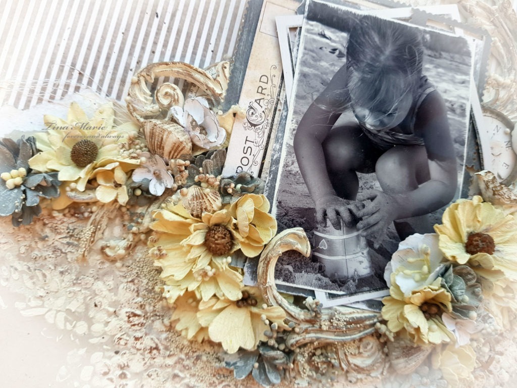
I have used the Celebration collection from Maja Design. I am so drawn to pokadots and also black. Although this isn't a true black I still am very drawn to it. And because it is not a true black I always think it is much easier to co-ordinate a multitude of colours with it.

I have used a photo of my gorgeous daughter at her formal this year. She looked absolutely gorgeous I think, but I am bias of course. A real princess. All she needed was a crown. For my project I decided to draw the colour from her dress into the layout by using browns and greens along with the black and cream from the Celebration papers. 


Party bs


Ephemera bs

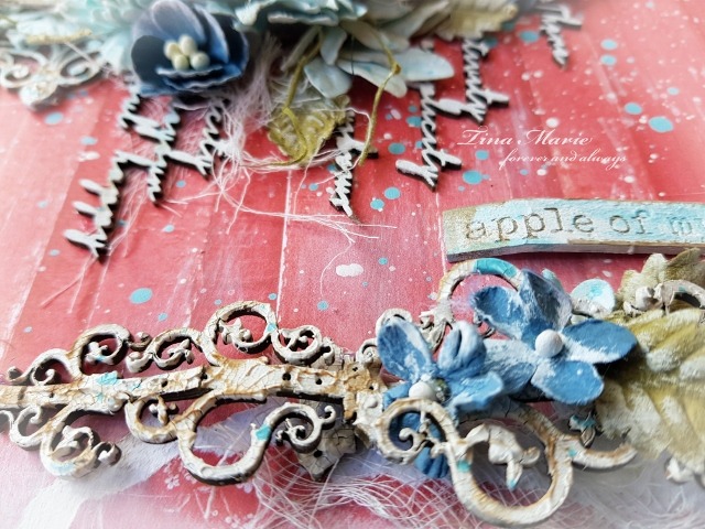
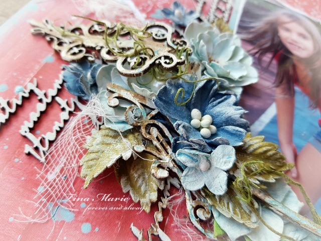
I tore Ephemera bs to sit over the top of the polkadots of Party bs. I didn't add any mixed media just lots of soft laces and some gorgeous flowers to do all the embellishing of this page. I love every now and then to keep it very simple and clean.
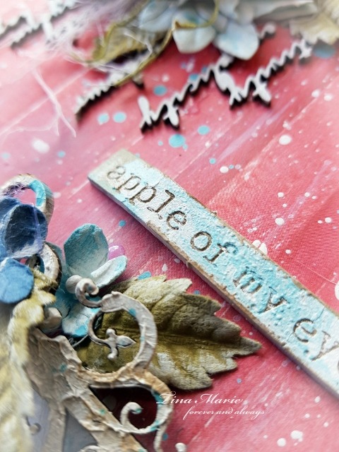
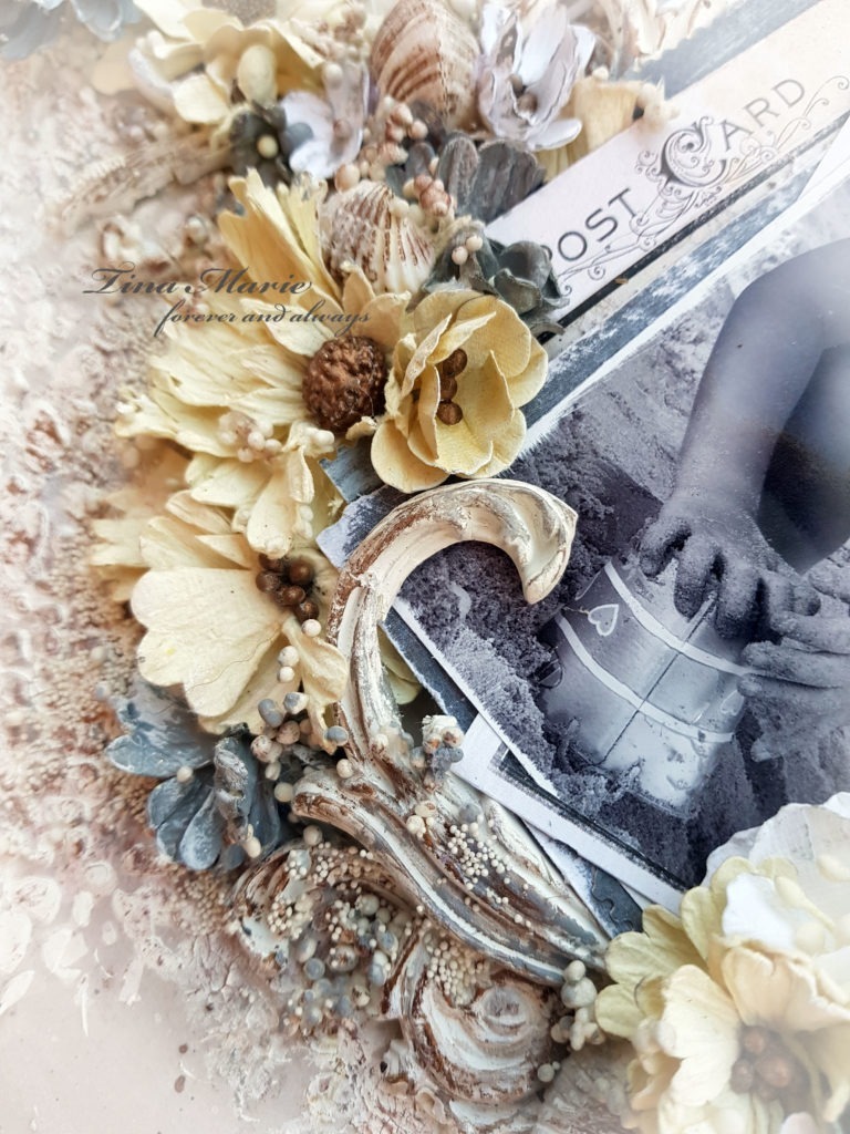
The chipboards have all been dressed in Black Soot Distress Ink and then wiped over with White Gesso and a little White Liquid Pearls to give a shimmer.


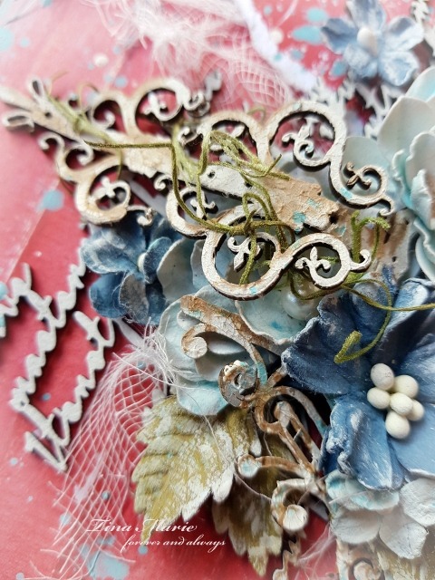
I love lace and recently I attented the Brisbane Expo where I found some of the most gorgeous pieces ever. Some of them I have used here. They have been cut into sections to sit around the flower clusters and to help take away from the black of the page.


I have added many layers of lace and chipboards to keep the focus on the prettiness of my background paper.


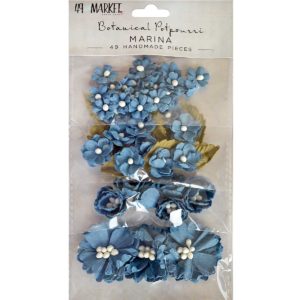
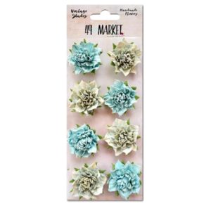
The gorgeous flowers used here are from 49andMarket. I have used the Aloe and Sandcastle colours from the Blossom Blends collection to help coordinate with the page.


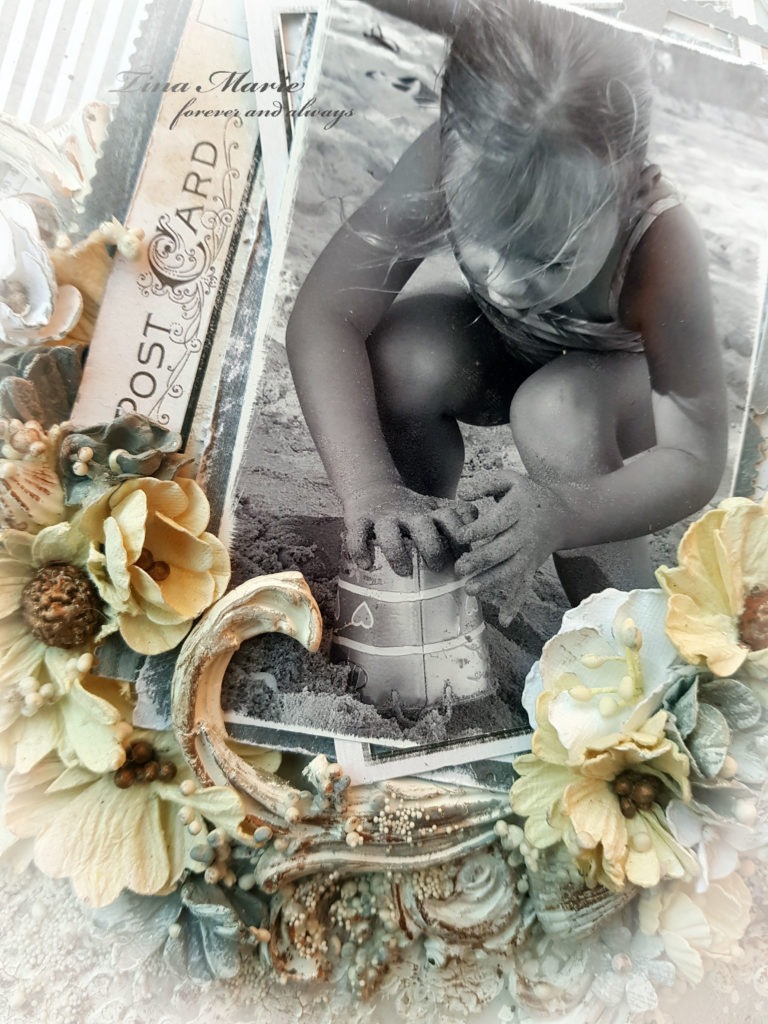
And one more closeup......


Well that is all from me today. I hope you have enjoyed my project and your visit to the blog.
Until next time happy crafting and take care.


Saturday 21 July 2018

"Apple of my eye"

Welcome back friends.
I'm back to share another project with you! This time around I have created with reds and which better collection to used other than the gorgeous Cottage Life.

This is "Apple of my eye".....


I drew inspiration this month from the gorgeous Dusty Attic moodboard challenge.
I absolutely love the colours in this but have to admit that I really do struggle using red. But I gave it a go by breaking up the red with a lot of new release Dusty Attic chipboards and blue shades of Botanicals from 49andMarket.


As I mentioned I have used papers from the Cottage Life collection. I have always loved these papers but had never really ever just used a red as a background.  The colours of the moodboard is red red red with a splash of blues and greens. So with this I went ahead layered my papers Rooster Row and Watering the garden. The torn pieces of Watering the garden were laid over Rooster Row and adhered. I tucked in a portrait photo of my youngest girl from a time when she used to love skateboarding on our tennis court. The moment I captured this favourite I knew it was always going to be a favourite memory. And just looking at it reminds me of the fun she would have.
I used some acrylic paints to highlight the outline and and areas of my layout. I also did a little splattering of diluted Oceania Blue to break up the red!


Rooster Row

Watering the garden

To help coordinate my layout I added in lots of new release Dusty Attic chipboards. These were dressed with Crackle texture paints, inks and acrylic paints.


I was lucky enought to receive a new package of goodies from the Dusty Attic this week. And I have to say Miss Jennifer has outdone herself. So I have used a lot but who wouldn't..... they are just divine. I firstly used the Decorative Hinges #3 combined with the oh so yummy chipboard script. 


I used two packs of the script and cut them up and run them vertically down the page. 


And below you can see how I have used the Windows and shutters. These are just too cute.


And to further embellish this project I have used lots of 49andMarket flowers. The Botanical Potourri's have been a big favourite of mine. And the Marina colour I loooooove !! I also used some of the leaves from this pack to add in a little of the green found in the moodboard. 

                   BP-87117 Botanical Potpourri - Marina 

                  VS-87032-Vintage-Shades-Botanical-Blends-Blue

I have added in some of the larger Botanical Blends in Blue. Some have been cut in half to go further. And of course some of the older style Vintage Shades to give my project a boost of blue.

Vintage Shades - Blue Blossoms VS-87162-Vintage-Shades-Potpourri-Blue 


I have also popped in some distressed sections of white cheesecloth and vine strands from my fibre collection.


And below you can see the Iron Garnish I have used to support my photo and hinges. This is an all time favourite chipboard piece. I will be using this one until the cows come home so to speak.


Well that is all from me today. I do hope you enjoyed my project and maybe even be inspired to use red in your next creation. Until then take care and I hope you get time to do some creating of your own.

Hugs x


Thursday 5 July 2018

"Postcard from Summer"

Welcome, Tina O with you here today to share my current project using some gorgeous 49andMarket goodies.
My project is titled
"Postcard from Summer "


So starting off my project was all about using the striped sheet from the Captured Adventures Laser Cut collection. I like a good stripe and grey seems to be a huge go to for me colour wise at present. It co-ordinates so well with so many colours and themes. From this laser cut collection there really is so much to choose from. So I started there and progressed to finding another piece to co-ordinate with the stripes. And I chose to use the back of the gorgeous piece titled Far Away Land. I did some tearing and adhered both for the start of my background. I did a lot of stenciling with some Paper Texture Paste. I added in some colour using Inka Gold in the gold brown. I also added in more texture using some Crackle Paste in a white.


Using the laser cut borders and filmstrips I used both sides and swapped them around. You can see below that I used a lot of the frames with lots of layering under my photo. I also popped the compass which I cut in half on either side on the underneath of the layering and I also added in the Postcard piece which was left over from a previous project using the Dandelion laser cuts that you can see below.
CO-86899-Dandelion-Fields-Laser-Cut-Out-Bonus 
Once my photo matting was completed and adhered I attached it to the right of my layout. In recent weeks I have been experimenting with moulds so I pulled out some of my favourites flourish moulds. I used a lot for this project but it was very special because of my photo so I didn't mind. These moulds were also coloured with Inka Gold and Acrylic Paints (Silver Cloud). These were then cut and layered around the photo as shown.


And last but not yet the least my favourite part to embellish with flowers. And of course I didn't hold back. I have used all of the packs below but not all the flowers. I like to used differing sizes in my clustering. Some of the large flowers were cut in half. They were all dry brushed with a little white gesso and I also added in some art stones in medium and mini sizes along with some shells from the beach and a little netting.


      .


Well that is all from me today. I hope you enjoyed my project. See you again real soon.

Hugs Tina xo

Special Guest

Special Guest
2017